Q&A: Artist Julia Schimautz on Risograph Printing and Her K2 Skis Collab

The Berlin-based artist talks about her studio process, '70s psychedelic aesthetic, and translating print art to ski topsheets

Q&A: Artist Julia Schimautz on Risograph Printing and Her K2 Skis Collab

Author

Amelia Arvesen

Photographer

K2

When it comes to the artwork that adorns so many outdoor products, sometimes the best inspiration comes not from within the community but beyond it. Case in point, the dynamic print art of Julia Schimautz, a graphic designer and printmaker based in Berlin—about as far from “the outdoor industry” as possible—who was recently tapped to collaborate on a new collection of skis for Seattle-based K2.

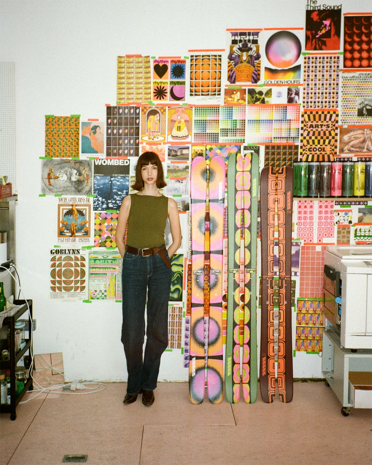
Schimautz specializes in risograph, a digital version of screen printing, to create striking works of art that celebrate color, vintage aesthetics, and a reverence for imperfections that are a result of the method. The result of adding Schimautz’s psychedelic risograph prints to K2’s new Omen Ski Collection is a set of six skis that deserve to be displayed at home as much as enjoyed in the mountains.

“Something that really drew me to Julia’s artwork was her ability to cross genres of still and motion image, as well as her ability to use tangible print artwork for motion in such a new, but traditional way,” K2 Design Director Brad Walters tells me. As it turned out, Julia’s use of risograph printing was not so dissimilar to the traditional screen-printing methods of developing topsheet art for skis.

K2-Omen-Ski-Julia-Schimautz-QA-5
Julia Schimautz and the K2 Omen Collection

“This converging of process has allowed for our work with Julia to keep her printing integrity in play without too much reliance on more modern, digital methods—all while adding tons of depth, and grit to the designs rarely found in today’s world of computer graphics,” he adds.

Schimautz grew up skiing in her home country Austria. After finishing her studies in Cape Town, she moved to Berlin where she co-founded Don’t Try Anything New Studio with two other artists. Early morning our time, afternoon her time, we talked to Schimautz, who is eager to test her new skis this winter, about risograph, adapting prints to skis, and her love of the ‘60s and ‘70s.


julia-schimautz-QA-lifestyle

Tell us about your studio space. Where are you right now?

We’re based in Berlin. We’ve got this beautiful big shopping window, so you can see the cars going past and people walking by. We’ve been here for two years now. Before, I was working from my apartment, which was a mess. It’s so nice to be able to leave the house, commute and be around people, and arrive at this space. I love our super crazy, colorful wall.

Can you describe the process of risograph printing? And what do you like about the medium?

Risograph is originally from Japan. The machine looks like this boring, super common photocopy printer. It was first used in churches, schools, and hospitals, where they wanted to have a big quantity super cheaply printed. Then, I think, in the ‘70s, the industry repurposed the use of the riso printer by printing scenes and posters super cheap and fast. They also decided to create custom colors. Each color comes in a massive drum. You print one color after the other, similar to screen printing. But instead of making screens, the printer does it all.

Because I’m a graphic designer, I love working with a computer—as opposed to lino printing and hand-crafted art. And I really love the mix between being able to work on my computer and stepping away and having this machine recreate my art. By having it out of your control, it looks different and surprises come out of it. But I feel like that’s the beauty of it.

julia-schimautz-QA-artwork

What was the process of adapting your prints to skis? What was your criteria?

I let K2 take a lot of the control. It was amazing to see how Brad saw my work and then translated it onto the skis. What we discussed early on was wanting to play with the idea of motion—having those frames on the ski like animation but still, then having the skis or snowboard in movement. It was created in the context of animation, motion, and movement, which I thought was really fun. We went for really uncommon winter colors. Instead of blue, we went with pink and green and browns. I feel like it’s a really unusual context in the ski world.

What drew you to vintage aesthetics and the ‘70s era for this collection?

With printing, it quickly gets this old record sleeve look with the texture and the imperfections. But generally what I like about the ‘60s and ‘70s is the shape-based, colorful repetition. It’s a little bit psychedelic in a way. It gets kind of weird. I also love the extreme use of color that is not as common after that era. I do feel like everybody is starting to appreciate color much more. I’ll be happy when the beige era is done.

julia-schimautz-QA-hero

Related articles
What It's Like to Make a Surf Film Among Alaska's Volcanic Aleutian Islands
Behind the Scenes of Ben Weiland's New Surf Film, Made in Alaska's Aleutian Islands

Q&A: Director Ben Weiland and photographer Nick Foster discuss creativity, cameras, surf, and their new film "The Search for Volcano Island"

Chef Brad Leone on Early Days, Elk Steaks, and Treacherous Surf Breaks
In Search of Elk Steaks and Surf Breaks with Chef Brad Leone

A conversation with the culinary outdoorsman on getting started flipping burgers at a ski resort, tips for cooking outside, reincarnation, and more

Q&A: New Documentary "Wade in the Water" Spotlights Surfing's African Roots
New Documentary Spotlights Surfing's Unrecognized African Roots

A conversation with film director David Mesfin on Black surfing, shifting cultures, and Africa's unrecognized role in surf history

Q&A: Inside the First Ever Ski Descent of Pakistan's Great Trango Tower
Q&A: Everything It Took to Climb & Ski Pakistan's Great Trango Tower

A conversation with Christina Lustenberger, Jim Morrison, and Chantel Astorga on what it took to climb and ski the 20,623-foot tall Great Trango Tower

Q&A: Photographer Matt Steindl on Art, Zines, the Quiet Beauty of Rural PA
Matt Steindl Talks Americana Moments, Changing Seasons, and Making Zines

Drawing inspiration from an artistic dynasty and his home region of Chester County, Steindl reflects on his work upon debuting his first zine

Community, Not Customers: A Q&A with Usal Founder Michael Washington

How the Los Angeles-based brand unites modern nature enthusiasts through retreats and workshops (and merch) championing inclusivity and accessibility

More articles